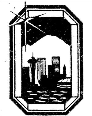
In 1982, the Seattle-King County Convention and Visitors Bureau adopts "The Emerald City" as an epithet for Seattle and incorporates it into a logo to promote tourism. (An epithet indicates some quality or attribute characteristic of the person or thing described. In Homer's Odyssey, "wine-dark" in "wine-dark sea" and "grey-eyed" in "grey-eyed Athena" are epithets which recur every time the sea or the goddess is mentioned.) The Convention and Visitors Bureau choose the name after putting on a competition for the best epithet or nickname. Several people submit "The Emerald City," and the grand prize winner (for her essay in support of the name) is Sarah Sterling-Franklin, a California writer and photographer who owns a summer home on San Juan Island. Runners up, including Kris Sherman, receive Space Needle passes and other goodies.
A City By Any Other Name...
Seattle's first common nickname, "Queen City of the Pacific Northwest," was actually coined by Portland-based real estate agents in 1869. After the Klondike Gold Rush began in 1897, Seattle promoted itself variously as the "Gateway to Alaska" and the "Gateway to the Orient."
In the 1950s, the tag "Jet City" was often used for Seattle, although Renton officially claimed this moniker. Beginning in 1975, Harper's Magazine and other urban observers dubbed Seattle "America's most livable city," which soon became an unofficial municipal motto.
Not in Kansas
In the summer of 1981, the Convention and Visitors Bureau ran a contest for a slogan for an advertising campaign. Sarah Sterling-Franklin of Carmel, California, came up with "Seattle, the Emerald City. Seattle is the jewel of the Northwest, the queen of the Evergreen State, the many-faceted city of space, elegance, magic and beauty" (Seattle Post-Intelligencer).
Sterling-Franklin received a one-week vacation in Seattle and a one-week vacation in Acapulco for her submission. Artist Karen Holum was retained to design the logo, which adorned ads, brochures, gifts, and t-shirts for at least the next 20 years.
Succeeded by Cyber Cypher
The logo was used until 2001, when it was retired in favor of a rebus combining a stylized eye, the email "@" symbol, and the capital letter "L" to phoneticize "See-at-L." The new trademark was designed by the local firm Hornall Anderson and won several awards. It is now the official city "brand" for the Seattle Convention and Visitors Bureau (which dropped King County from its name) with the slightly tongue-in-cheek pitch, "Seattle: soak it up."

